01 — Typography
Minimalist sans-serif paired with traditional Japanese characters. Large headings create hierarchy without color or decoration.
Modern Japanese Cuisine
Kaze (風 - meaning "wind") is a modern Japanese restaurant focusing on seasonal omakase experiences. The challenge was to create a digital presence that reflects their philosophy: less is more, quality over quantity, and respect for negative space.
The resulting single-page website uses extreme white space, monochromatic restraint, and precise typography to mirror the restaurant's zen aesthetic. Every element serves a purpose; nothing is decorative.
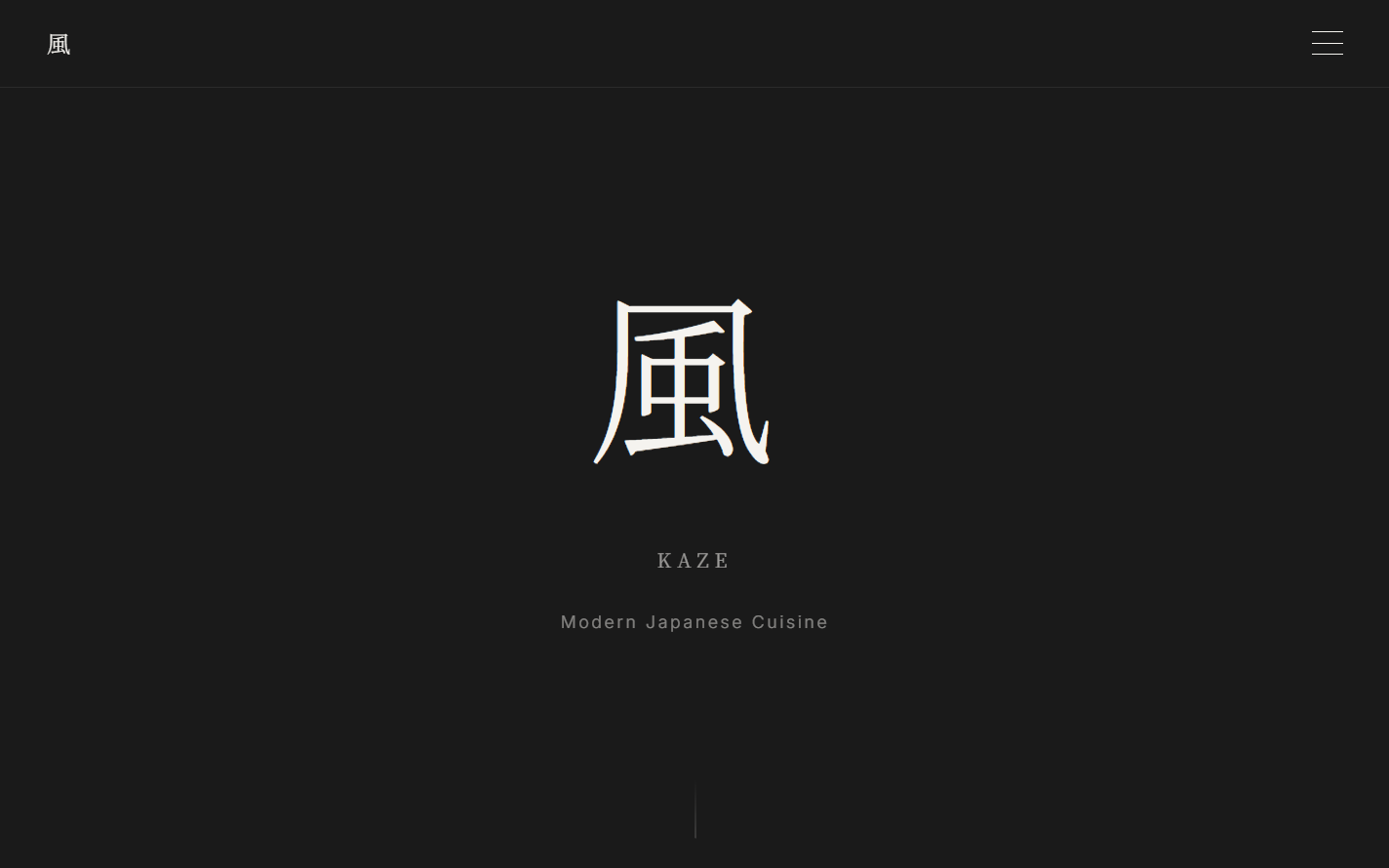
Hero section showcasing extreme minimalism and Japanese typography
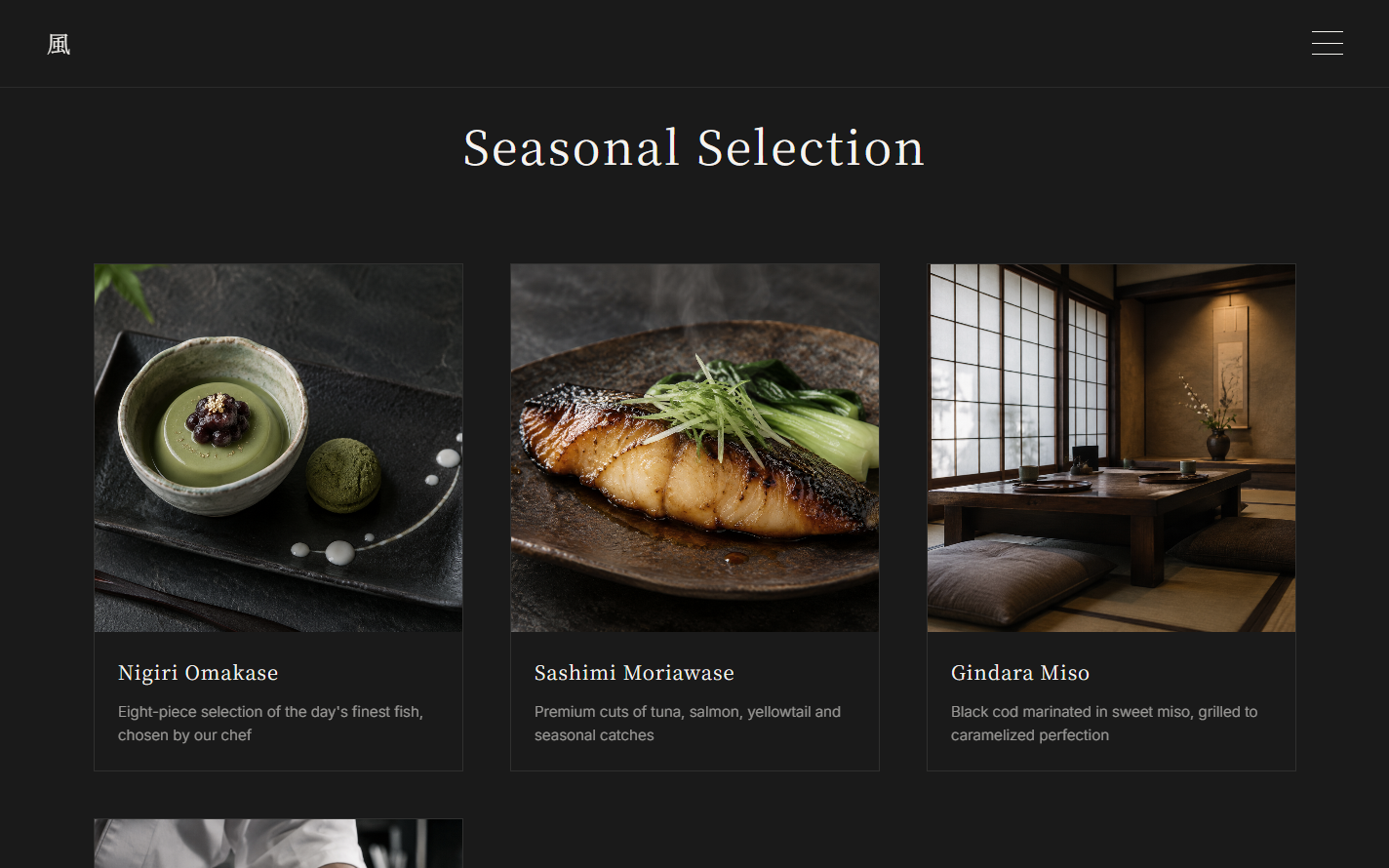
Menu section with generous white space
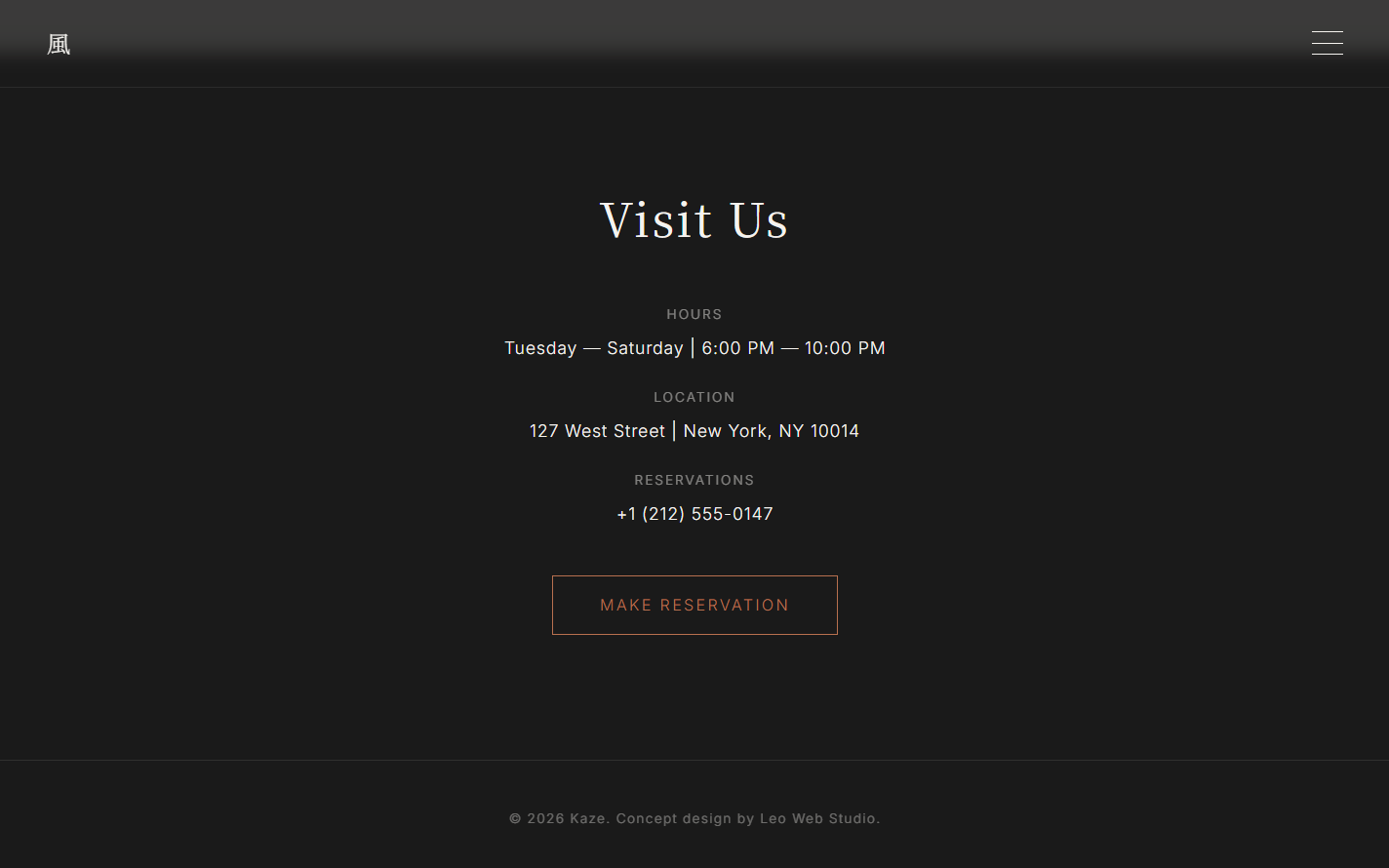
Contact section with monochromatic restraint
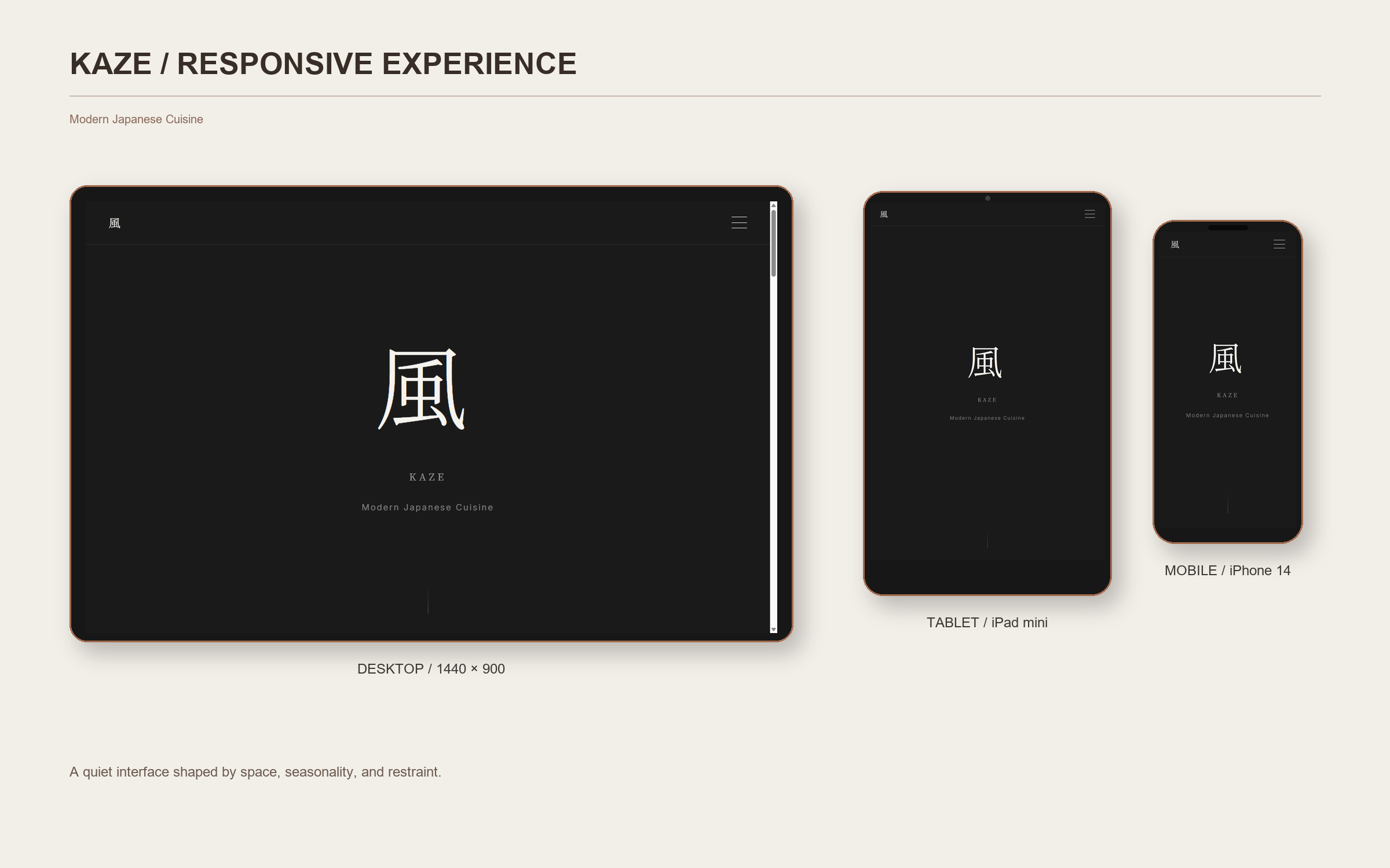
Responsive design across all devices
Minimalist sans-serif paired with traditional Japanese characters. Large headings create hierarchy without color or decoration.
Primarily monochromatic: black, white, and subtle grays. A single accent of deep indigo for interactive elements.
Generous margins and padding create breathing room. Content occupies roughly 30% of the viewport at any given moment.
Subtle, slow animations. Elements fade in gently. No aggressive motion or attention-grabbing effects.
A restrained visual system can still make practical actions—menu, hours, location, and reservations—easy to find. The design uses space as an active part of the guest experience rather than leaving the page feeling unfinished.
Let's discuss how restraint, rhythm, and clarity could work for your restaurant.